Sequel, the medtech start-up behind twiist, had gotten its name as the new chapter
for its founders—all legends in their fields. Much of the brand story they were
telling centered around these founders’ legacies. But as the company began to prepare
for an IPO and to expand its portfolio beyond twiist, it needed to tell a new story.
One centered on its groundbreaking yet accessible technologies and their ability to
change lives.
Coming off the national twiist campaign launch, my partner and I went to work
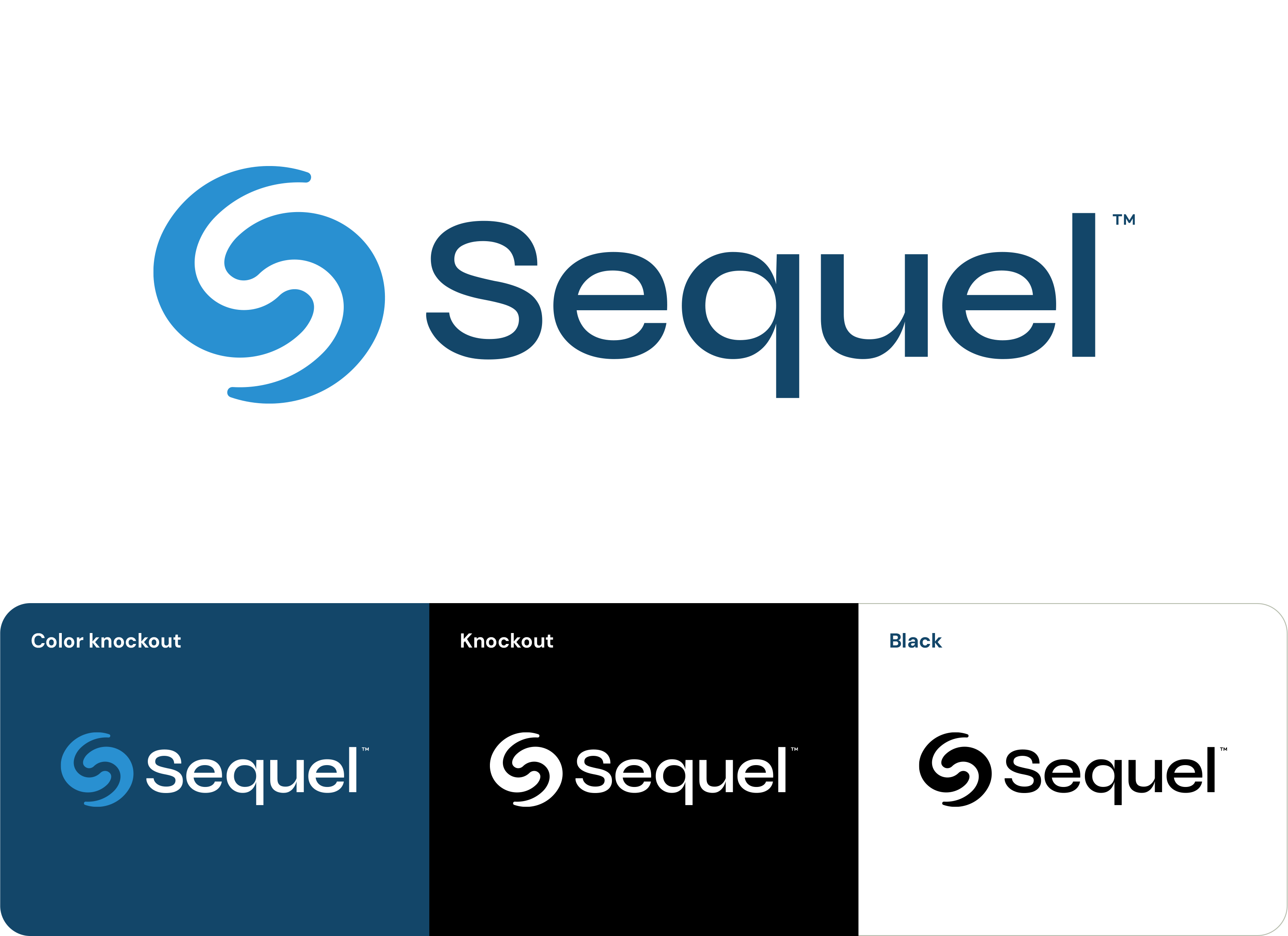
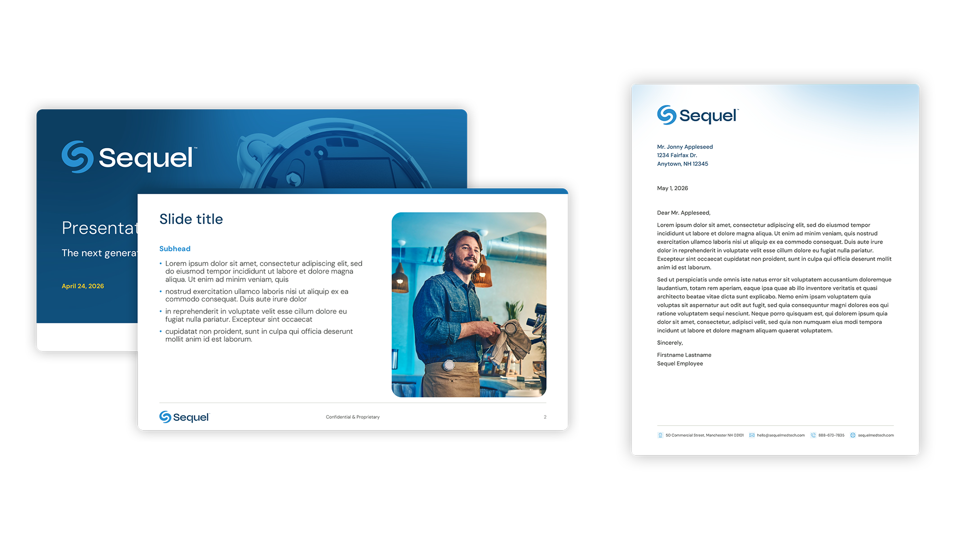
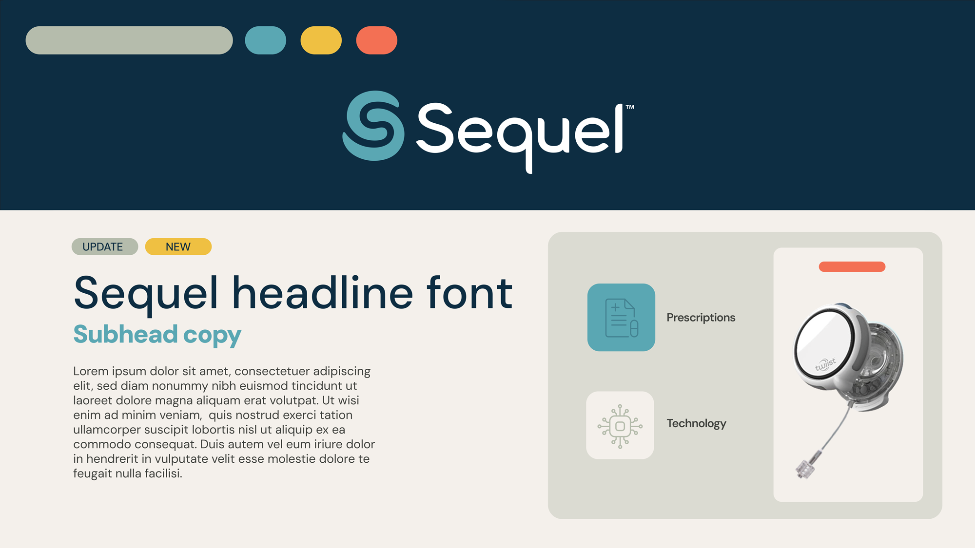
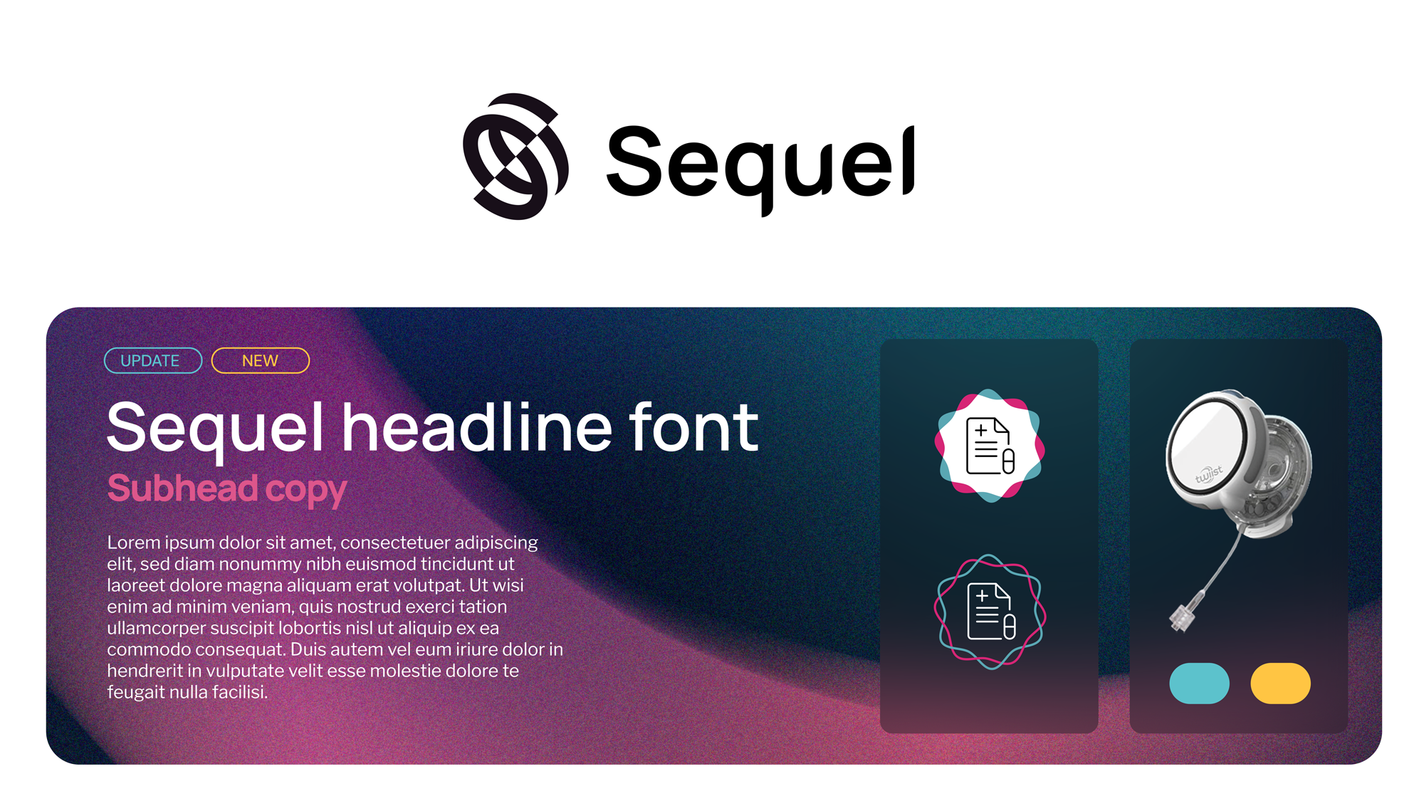
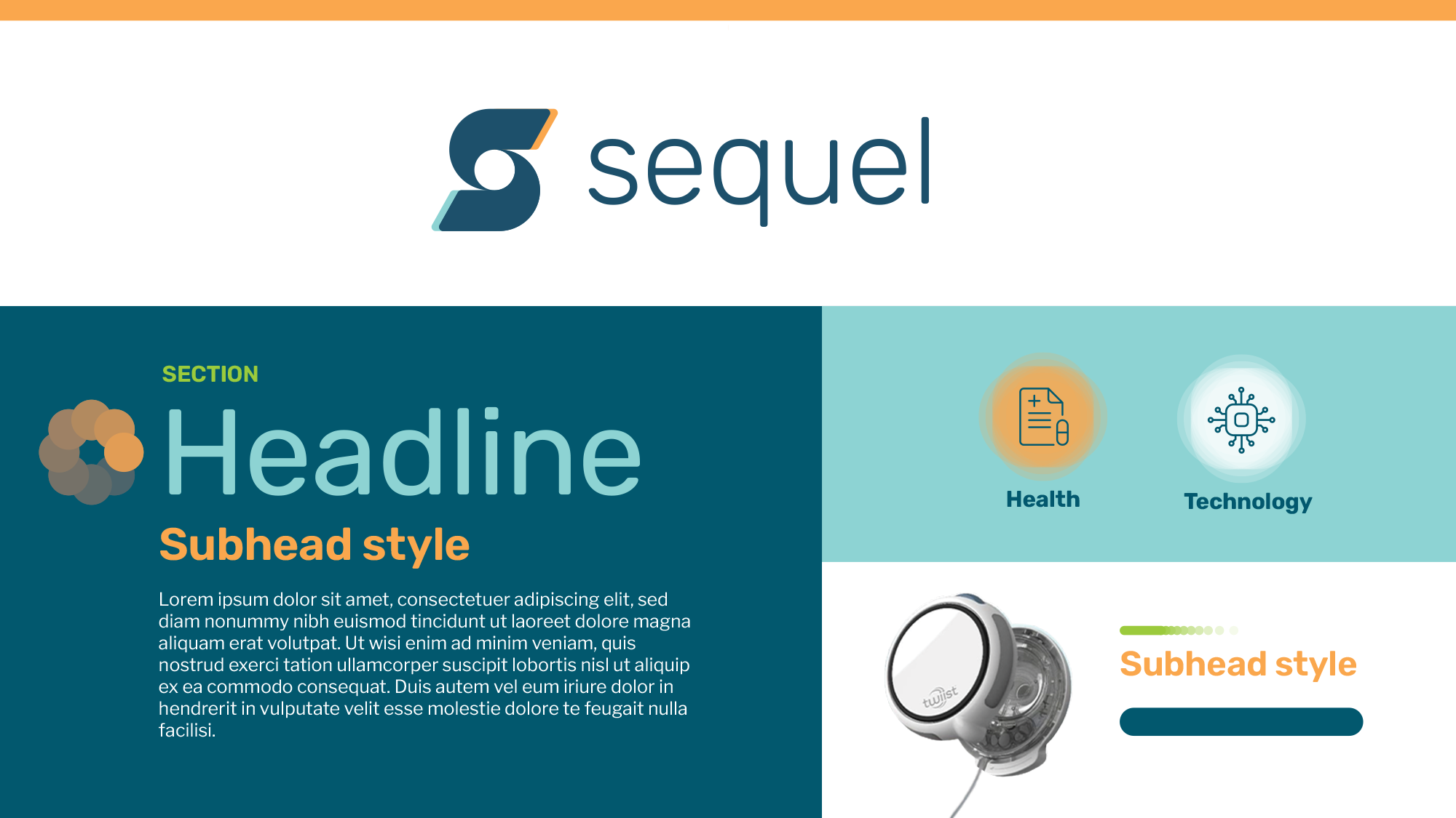
redesigning the brand architecture from the ground up. I refined the logo, making it
symmetrical, adjusting its angle, and swapping its typeface to be sharper, more
modern, and have more momentum. The colors, the fonts, the photography were all
brightened and enlivened, with subtle connections to the twiist branding, and we
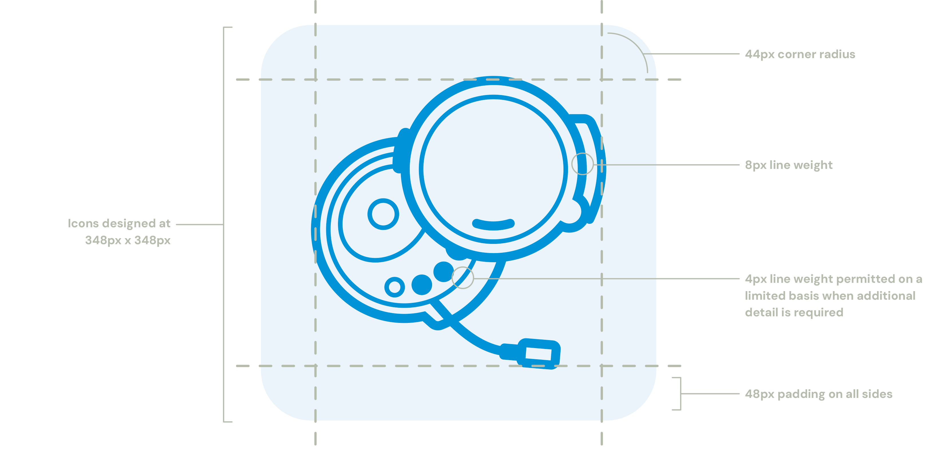
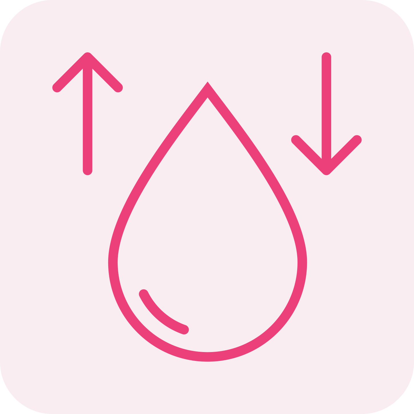
developed a rich library of custom icons that were clear but playful.
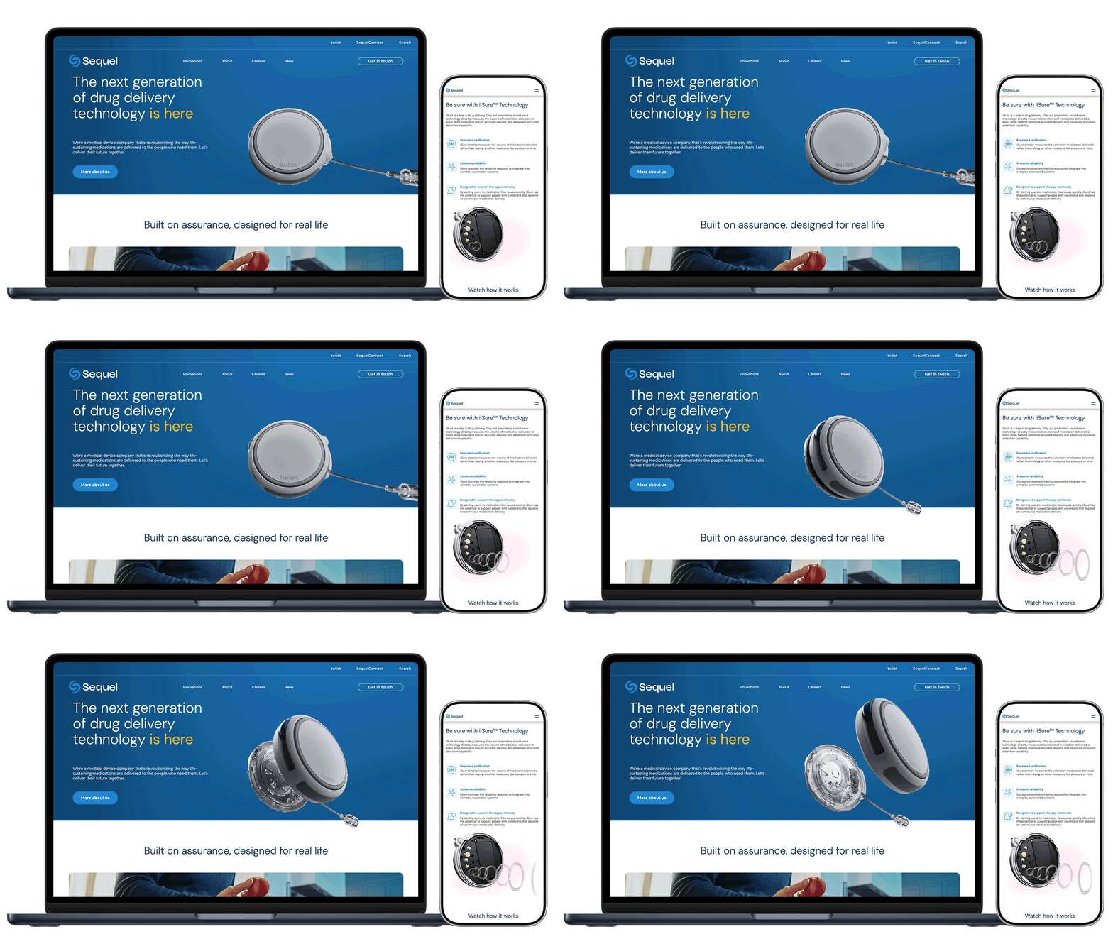
In both messaging and imagery, the technology was made hero, but always grounded in
the care and dedication of the staff at Sequel, and the affect that has on their
customer’s lives.
The end result reframed Sequel as an approachable, fun, yet world-changing technology
company: serious—but not too serious—and ready for the future.